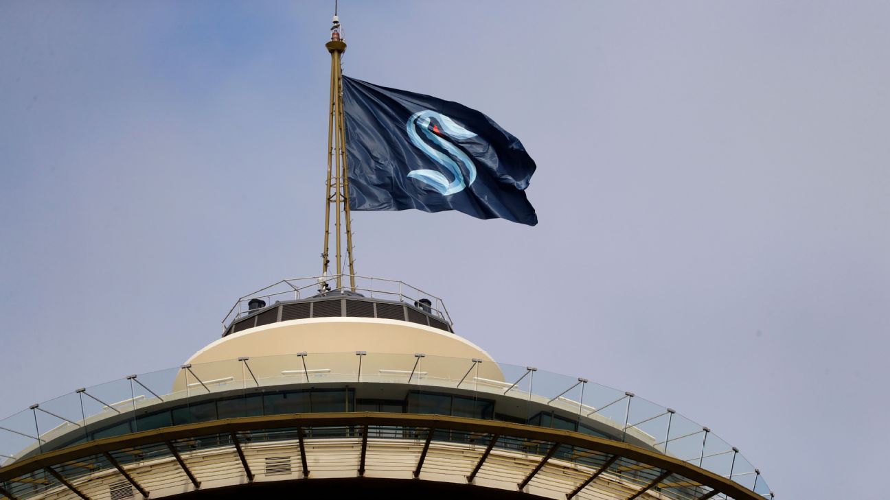
We have known since 2018 that Seattle would be the NHL's 32nd franchise. But until Thursday, we didn't know the team name, nor the logo, nor the colors -- although speculation ran wild over what all of that would be.
Now we know: It's the Seattle Kraken, and upon the release (sorry) of the official name, logo, colors and uniforms came a wave of reaction from around the sports-loving world, particularly in Seattle, a city whose residents have been clamoring for that intel for nearly two years. It's no wonder the team needed to be so diligent at keeping everything under a cloak of secrecy.
So how did it do? Our panelists weigh in with grades on each aspect of Thursday's reveal, from 1 to 10 (with 10 being the highest):
RELEASE THE KRAKEN... onto your phone, desktop, or Zoom background with these ? wallpapers. pic.twitter.com/EYIJ4Nc9I0
— Seattle Kraken (@NHLSeattle_) July 23, 2020
Seattle Kraken. Love the Space Needle anchor. Jerseys via @icethetics. pic.twitter.com/TT84styfkd
— Frank Seravalli (@frank_seravalli) July 23, 2020
Brady Henderson, ESPN Seattle Seahawks reporter
Name: 4. I'll say it -- I don't like it. This lifelong Seattleite was hoping for a name that evokes Pacific Northwest pride, one that carries meaning here. Kraken only gets part of the way there for me. The marine aspect is cool -- Seattle is surrounded by water, some of which is home to squid and octopus -- but it's a stretch to say there's much regional relevance with a mythical creature of Scandinavian lore. It feels like a less generic but more gimmicky version of the XFL's Seattle Dragons in that regard. Seattle Sockeyes would have been perfect. It rolls off the tongue. It sounds like hockey. It's regional. And look at a spawning sockeye salmon and tell me that wouldn't easily lend itself to an awesome color scheme. It would have doubled as a tribute to the old Seattle Metropolitans, who wore similar colors. But, Kraken is bold, I'll give them that.
Logo: 5. I like the understated approach over a cartoonish depiction of a Kraken, and I get the vibe of mystery that the design team was going for, but the primary logo is a little too quiet for me. They could have included some subtle suckers to make the tentacle more identifiable than it is with just the profile view. Without more distinction, the S looks old-Englishy (pull up The Seattle Times' Twitter page and you'll see what I mean). The Space Needle in the anchor is real slick -- lots of tattoo potential there.
Colors: 7. If a sea creature like Kraken is the name, then dark blue is the obvious choice for the primary color. Green or gray could have looked nice as complementary colors but might have made the whole scheme look less distinguishable from those of the Seahawks or Mariners. The other shades of blue work well together, and the red gives it just enough of an accent without looking out of place.
Uniform set: 8. The whole is greater than the sum of its parts here. Put it all together and these are sharp, especially the road jerseys. My favorite aspect is how, to my eye, the lighter blue takes on a turquoise hue when contrasted against the white. Looking at the lettering on the back of the road jersey, I think the front would pop with more dark blue. But all in all, well done here.
Emily Kaplan, national NHL reporter
Name: 9. Kraken is unique. It's weird. I mean, it's a mythical sea monster -- a lot of people probably have no idea what it is, and it's unclear if the fictional creature of the original myth even lives in Pacific waters. But the Kraken identify as a fan-serving franchise, and it feels authentic to the community. You're either in on it or you're not one of us.
Logo: 8. Smart decision to pay homage to the Metropolitans with the S and not opt for something cartoonish, but it's the use of negative space that sold me. I love how Adidas Design Director Matty Merrill describes it: "While you're seeing the 'S,' and thinking about the Metropolitans, thinking about the colors, that negative space tentacle is hiding there, wrapping around your ankles, ready to pull you down."
Colors: 6. The colors pop -- especially that icy cool blue on the deep navy. Of the 31 existing teams in the NHL, 16 have shades of blue, but Seattle's feel distinctive. That said, I would have loved an element of green. And while they added red accents to differentiate themselves from other blue teams in the league, the last I checked the Winnipeg Jets have that too. Poor Winnipeg.
Uniform set: 8. Something about them just feels sharp. I like the secondary logo of an anchor on the sleeves, which features the Space Needle. But I especially like that there's no white at all on the home jerseys, which gives them a unique look.
Arda Ocal, staff writer and esports caster
Name: 10. RELEASE THE KRAKEN ... are you kidding me? This is the name we all wanted, and we got it. Well, when I say "we," I mean the internet, and we should always listen to the internet. In all seriousness, this is the perfect name for this generation of hockey fan. It's goofy, it lends itself to some puns and humor, and it can still become intimidating and taken seriously when it needs to be. I love it. Plus, there's a great Ron Francis continuity storyline here, now becoming the general manager of a nautically themed team after being drafted into the NHL by one (the Hartford Whalers). And on a side note: I would guess the number of people googling "Kraken" today shot up by about 7,000%.
Logo: 9. I love the details and intricacies included. Like how the shoulder patch anchor logo includes the Space Needle. How the S is an homage to the (Stanley Cup champion) Seattle Metropolitans. Not to mention the tentacle on the inside of the body of the S, and the menacing red eye. I know it's a nautically themed font, but the only thing I'm not really crazy about is the actual "Seattle Kraken" writing (which you see at the end of the reveal video) ... needed a bit more red there for my taste. But overall, still a big fat W here.
For any esports fans out there, the logo does definitely have a vibe of "If The Florida Mutineers and Seattle Surge from the Call of Duty League had a baby."
Colors: 7. Blues for the water theme, check. Red alert -- that fits the theme of terror. Without the red accent, it's a bit lacking (like I said above, the "Seattle Kraken" fully written out feels like it's missing the red as that exclamation mark). And the team now has a natural "colorway rivalry" with the Jets to go with the "who rules the open waters?" rivalry with the San Jose Sharks ... and come to think of it, the Hurricanes must wear the Whalers threads at least once against the Kraken.
Uniform set: 8. They look well put together. I also love the "Kraken" inside the collar, where we've seen many Easter eggs on sweaters of many different NHL teams (the Nashville Predators' piano keys is still my favorite). No matter their allegiance, hockey fans will want to buy at least one piece of Kraken merchandise. Plus, you know eventually we're getting an alternate jersey with an actual Kraken ... or Liam Neeson's face from the 2010 version of "Clash of the Titans" ... either will be fine.
Greg Wyshynski, senior NHL writer
Name: 7. It's a tremendously cool mascot: a multi-tentacled, seemingly indestructible beast that emerges from the deep to destroy all in its path. It's as close as we're coming to having an NHL team named after a kaiju. It's instantly memorable, extremely original in comparison to other pro teams and a headline writer's dream. But I'm docking it three points from perfection. One point for the mass noun/non-plural name (i.e., Wild and Heat), which is a sports pet peeve and was frankly avoidable here, since Webster's defines the plural of Kraken as either "Kraken or Krakens." A second point is deducted for not being a name the locals have supported throughout the process -- Sockeyes and Metropolitans won more Seattle fan polls. And a third point for encouraging a slew of "krak"-adjacent nicknames like "krakheads"; while a lot of us find them humorous, it needs to be acknowledged that many feel "crackheads" has racial connotations. So perhaps we tread lightly there.
Logo: 10. There's actually a lot going on here. The S itself is both a small Kraken and evokes the hull of a ship, in two nice maritime nods. The negative space tentacle is instantly iconic. The waviness of it makes it feel alive. Sure, it sorta looks like the "S" from the Seagrams beverage company logo, only with a San Jose Sharks-esque glowing eye on it. But greatness borrows while genius steals. What elevates this to a 10 is the secondary logo, with the Space Needle on that hook. It's better than a good portion of current NHL primary logos.
Colors: 7. You know how sometimes you're watching a movie and you're like, "I wish this was as good as the trailer?" Well, Seattle had been using a salmon-and-light-blue motif on its branding before this week's reveal, so it was a little disappointing not to see that incredible and unique color combination make the final cut. Also, I've always been partial to Seattle teams leaning into that Emerald City vibe with the green like Sounders FC did, as opposed to heading more in the Mariners direction like the Kraken. But hey, at least it's not red and black, which is what the ownership group was considering at the start.
Uniform set: 9. These are some sharp-looking sweaters. The blue is dark enough to evoke black without being, like, the 800th jersey in recent NHL history to rock a solid black base. The red accent stripes pop. As when the Golden Knights revealed theirs, the road whites look especially sharp. But what I liked about the Vegas sweaters was their weird little patterns and textures, and at first glance these Seattle jerseys don't have them. But the potential is enormous for the alternate jerseys that are already in the planning stages, especially ones that put that incredible Space Needle secondary logo front and center.


 Phone: (800) 737. 6040
 Fax: (800) 825 5558
 Website:
  Email:


