
With the 2021 MLS season opening on April 16, clubs are starting to release their new kits for the season. So we decided to look back at the 10 best and 10 worst kits in Major League Soccer history.
- 2021 MLS: All you need to know
- ESPN+ viewer's guide: Bundesliga, Serie A, MLS, FA Cup and more
The best
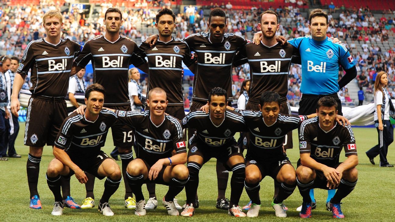
10. Vancouver Whitecaps | 2012 third kit
Go back through the 10 seasons of the Whitecaps' MLS existence and you'll find a slew of beautiful jerseys, but the third kit they donned in 2012 deserves special recognition. It's not often that a club is bold enough to wear a brown kit, but Vancouver did just that, taking inspiration from the forests of British Columbia. It paid off, too, as that season the Caps became the first Canadian club to qualify for the MLS Cup playoffs.
9. Houston Dynamo FC | 2018 alternate kit
This 2018 alternative kit recalls the rainbow jerseys -- or, as you may know them, the "tequila sunrise" jerseys -- Houston's baseball team, the Astros, wore from 1975 to 1986. Set against the striking black base, the Dynamo hit upon a modern and intimidating look that offered a nod to the city's sporting history.
8. Chicago Fire FC | 2005 third kit
The original Fire uniforms were iconic and probably deserve a place on this list, but teams -- and their kit suppliers -- deserve praise for taking risks, and the third kit Chicago played in for 2005 was certainly a departure from the club's red-dominant palette. And by taking inspiration from the city's flag and landmarks like Lake Michigan, the Fire created something that resonated across Greater Chicagoland.
7. Dallas Burn | 1998 away kit
There's a lot to like here, from the thin green-gold hoops to the classic collar, making Dallas' 1998 away jersey (which they wore at home rather frequently) a crisp, clean addition to this list. The Burn name is no longer -- and even in this era of endless and sometimes unnecessary rebrands, that's probably for the best -- but FC Dallas would have a hit on its hands if they brought this one back.
6. Seattle Sounders FC | 2012 third kit
There's no bolder selection on this list than Seattle's 2012 third kit, made up of what Adidas calls "super cyan" and trimmed with "electricity." The result is electric, so hats off to the color-naming departments at Adidas and the Sounders.
5. San Jose Earthquakes | 2017 primary kit
The 'Quakes have a checkered history when it comes to jerseys (more on that later), but the primary top introduced for the 2017 season is among the best in their MLS history. Designers' inspiration needs to be authentic and it needs to be tangible, and the way that the offset-chevron pattern of the club's crest was not only integrated into the jersey's design, but was made the focal point, means this was an instant classic in the South Bay.
4. Kansas City Wiz | 1996 home kit
Adidas supplied three of Major League Soccer's 10 clubs in its inaugural season in 1996, and all three clubs (Kansas City, Columbus Crew and D.C. United) could have held a place on this list, but it's Kansas City who deserves special praise. There was an element of clean lines to all three of Adidas' clubs that year, but the Wiz were bold in opting for a rainbow kit that stood out among a sea of out-there looks that haven't aged nearly as gracefully.
3. Portland Timbers | 2014 third kit
In this league, if you've got a history dating back 45 years, you lean on it. The third kit launched for 2014 harks back to the tops the Timbers would have worn, around the time the club was founded in 1975. This is a throwback brilliantly executed, devoid of gimmicks, with emphasis on simplicity.
2. New England Revolution | 1996 away kit
D.C. United is often held up as the shining example of a MLS kit. But if there's one top that encapsulates that first year of MLS, it's this one. The firework of a design element across the chest, the grungy "Revolution" wordmark, this was a jersey full of the mid-'90s alternative energy that fueled the league's liftoff.
1. LA Galaxy | 2005 home kit
MLS's original glamor club tops this list with this gold offering from 2005. This was the second time that the Galaxy wore a sash, which in recent years has become a staple of the team's tops, and between that and the striking color combination, the Galaxy had arguably the most stunning of all Nike's jerseys set on a template worn by the likes of Manchester United, Arsenal and Barcelona. As if that wasn't accolade enough, Landon Donovan & Co. went on to lift the MLS Cup in these beauties.
The worst
10. Columbus Crew SC | 2016 secondary kit
The Crew looked to the Columbus city flag for the secondary kit launched in 2016, and while that's the sort of inspiration we like to see in a jersey, the execution left something to be desired. The flag is made up of red, yellow, white and sky blue, so the Crew have all the ingredients, but that's a lot of color to put into one coherent design. Add the gradient stripes to the mix and it's a busy, busy, busy kit.
9. Tampa Bay Mutiny | 1996 home kit
There's a lot going on here, even before you take into account Carlos Valderrama's excessive accessories (weren't the '90s great?). This Nike template, which several other of the league's inaugural clubs wore, features sleeves (sky blue) and side panels (navy blue) that contrast the green on the front and back of the jersey, and then the odd, vibrating cross pattern on the sleeves themselves.
8. Real Salt Lake | 2014 primary kit
RSL's color palette has never worked particularly well. The past two years have seen the club focus on designs that feature one or two colors, with the others playing more of a supporting role, which has made its offering much more appealing. This home shirt launched in 2014, however, has a lot of all of claret, cobalt and gold which makes it jarring.
7. San Jose Earthquakes | 2019 primary kit
Chris Wondolowski broke MLS' all-time goal-scoring record in this jersey. With asymmetrical blocks or stripes of color, it's hard to find any inspiration for the design, which makes it look like the 'Quakes wore off-the-rack kits in 2019 and 2020.
6. Seattle Sounders | 2016 primary kit
The Sounders weren't the only team in MLS to wear this template in 2016, but the other two who did (New York Red Bulls and Orlando City SC) used complementary colors or white to soften the contrast between sleeve and body. The Sounders lifted the MLS Cup wearing this jersey, so it will assuredly go down as a favorite in Seattle, but the Sounder Blue sleeves set against the Rave Green body was awfully jarring.
5. New York Red Bulls | 2019 home kit
Contrary to popular belief, gray kits can work, but this one doesn't. Not because it's gray -- although that hasn't helped -- but because of the computer-error style "Glitch effect" printed slogans down the front of the shirt, reading "Love," "Fight," "Passion" and "Glory."
4. Montreal Impact | 2020 away kit
It's hard to get too excited about a grayscale kit. Presumably this was meant to be the silver of the club crest, but it's hard to make a jersey look metallic and the result looks... well... gray.
3. LA Galaxy | 2013 third kit
This was a fan-designed kit, and that fan's intentions were good. He looked to the Galaxy's inaugural 1996 uniform for inspiration and, say what you will about that Nike template (which you'll see in just a second), it was memorable. Unfortunately, the result is compromised by colors that are brighter than that '96 jersey, and applied to different panels and areas than the original, making this top look more like something Mexico might wear than the Galaxy.
2. San Jose Clash | 1996 home kit
The infamous Nike template. But the Clash weren't the only team to use it -- so did the New York/New Jersey MetroStars and the LA Galaxy. What's most bizarre about this jersey is the color. The red that dominates the logo is used for the tiniest trim along the collar and the yellow that accents the logo makes up the left half of the shirt. The next-most noticeable colors are a neon sky blue and a forest green, neither of which feature on any branding.
1. D.C. United | 2017 secondary kit
D.C.'s secondary kit for 2017 took inspiration from an eagle's wings (as seen on the club crest) for the pattern printed across the chest. And the crest is an admirable place to find design ideas to build on... But when a player puts on this jersey, those shapes look more like some sort of mutant pec/ab hybrid you'd find on the costume of an animated superhero.


 has become MLB's best closer")


 Phone: (800) 737. 6040
 Fax: (800) 825 5558
 Website:
  Email:


